
Executive Summary
This isn't an AI case study. It's the project that taught me the design principles I now apply to every AI system I build, under stakes higher than any dashboard metric.
A care coordination app for cancer patients, built from the ground up: scheduling, care team messaging, treatment plan comprehension, and ongoing lifestyle support.
Sr. Product Design Lead, partnered with one of the most mature dedicated UX research organizations I've worked inside.
MSK needed a unified digital front door across a large hospital network, replacing fragmented tools and phone-based processes for patients mid-treatment.
Patients navigating cancer treatment faced a fragmented digital experience that added cognitive and emotional burden at the worst possible moment.
Prove that "clarity is care" has measurable product value, that UX investment here isn't a satisfaction-score exercise, it's a clinical-experience requirement.
Built the end-to-end experience within a mature research org, and pushed the team toward emotional-state-aware design patterns that the clinical/IT default wouldn't have produced on its own.
A calmer, clearer patient experience spanning scheduling, care team communication, and treatment tracking. More durably: this project is the origin of the design conviction that now defines my AI/UX work, that legibility and respect for a person's agency under cognitive load is the same design problem, whether the stressor is chemotherapy or an opaque algorithm.
- Warm terracotta instead of clinical blue for primary actions: a deliberate move away from "hospital software" toward something a person would want to open on a hard day.
- A single accent (lavender) reserved for emotional/mood elements only, so feeling states read as distinct from clinical data entry, never confused with it.
- Soft, rounded cards and generous whitespace throughout. Density is the enemy when the reader is cognitively overloaded.
Mood-check icons and primary buttons are sized generously, larger than a typical clinical form would call for, because the people using this are often stressed, fatigued, or operating one-handed from a hospital bed. Scale here isn't decorative, it's an accessibility decision disguised as a style choice.
The emotional check-in appears first and largest, ahead of any clinical field, in every flow where both exist. That ordering is a deliberate stance: how someone is feeling gets asked before what their symptoms are, because the two aren't equally urgent to the person answering, even if they're equally urgent to the care team reading the data later.
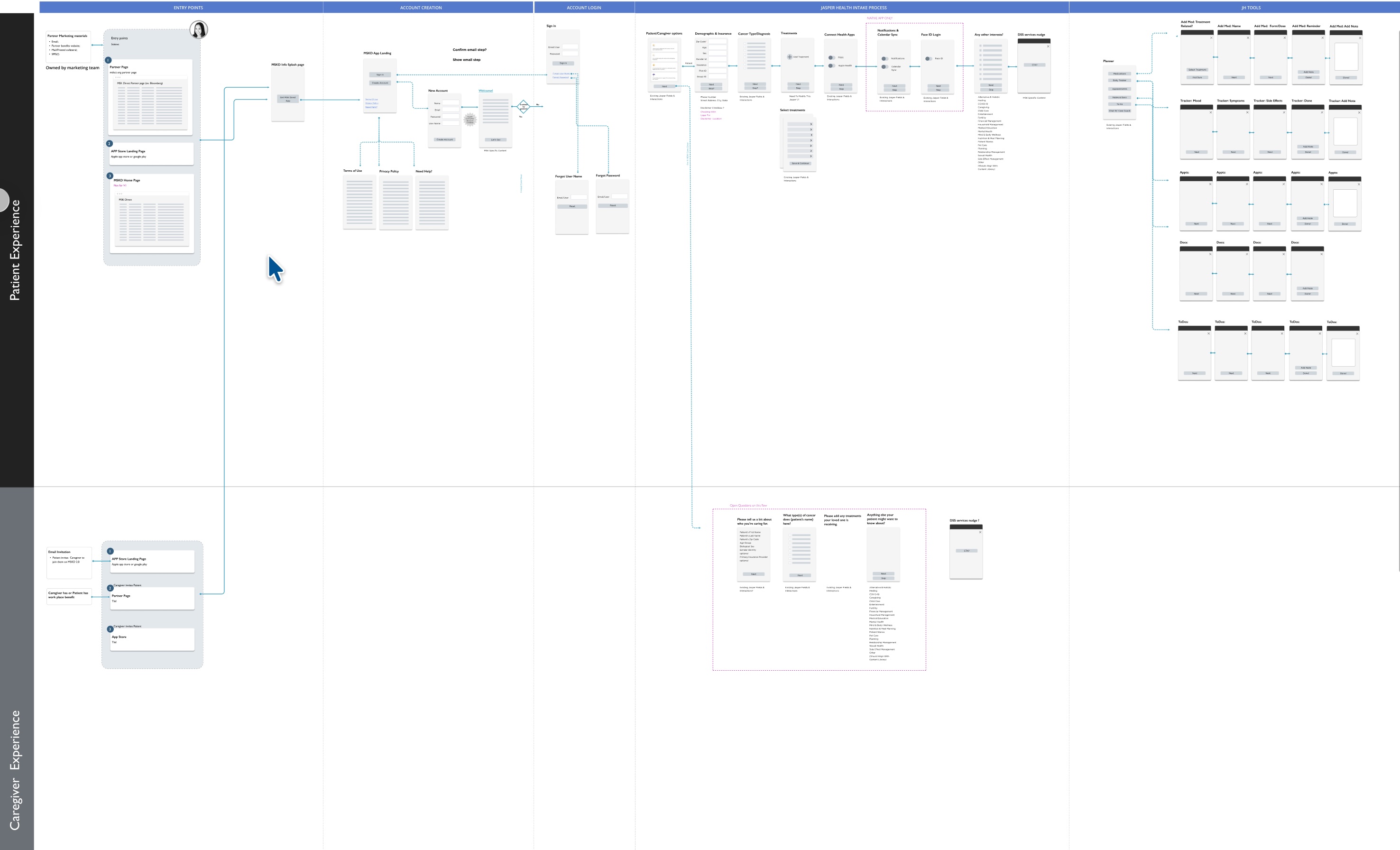
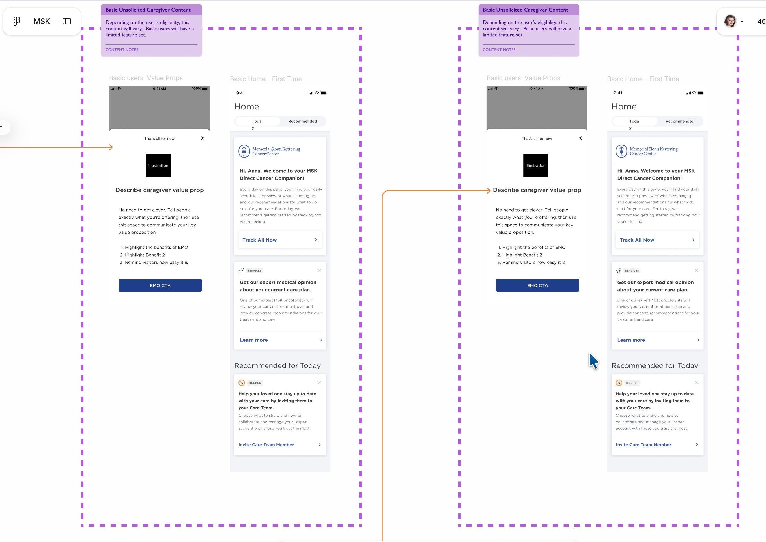
In Systems Thinking, the caregiver content-model spec and the full patient/caregiver flow map are sized as equal partners on the page, not one subordinate to the other. That equal visual weight is intentional: the caregiver's experience isn't a footnote to the patient's, it's a parallel system that needed its own equally-weighted design attention.
Warm terracotta sits against a soft, deliberately low-contrast canvas instead of the harsh clinical blue-on-white most healthcare software defaults to. Lowering the baseline contrast of the canvas itself, not just swapping the accent color, is what actually changes how "clinical" the product feels at a glance.
Symptom entry and its severity slider sit close enough to read as one grouped action, proximity doing the work of a label. Between unrelated modules, like symptom logging and appointment scheduling, the layout uses a full section break rather than just a divider line, so someone in a fragile state is never left guessing whether two nearby elements are related.
Whose definition of "care coordination" wins?
This isn't an AI product, but the ambiguity at the start will look familiar to anyone who's tried to align a team around a new AI feature: everyone had a different definition of success.
"Care coordination" meant different things to different stakeholders, and nobody had reconciled them into one coherent experience. IT wanted a portal. Clinical staff wanted fewer phone calls. Patients wanted to feel some sense of control over a process that had taken control away from almost every other part of their lives.
The assumption I had to challenge was the efficiency reflex: the belief that fewer clicks and more automation are automatically the right answer. In most software, that's true. In this context, sometimes a slower, more explicit step is the more respectful, safer choice for someone in crisis.
Moving the team from a vague mandate ("digitize hospital processes," an IT-systems lens) to a usable product experience meant reframing the goal in human terms: reduce the burden on a person mid-crisis. Same underlying features (scheduling, messaging, treatment tracking), but a completely different set of design requirements once the lens changed.
I include this project in a portfolio of AI work deliberately. The stressor here was cancer treatment, not an unexplainable algorithm, but the design problem is identical: when a system makes decisions that affect a person under real cognitive load, transparency, pacing, and control aren't UX nice-to-haves. They're the product.
The daily flow, diagrammed. The fork at step three is the whole design thesis: not every piece of information deserves the same speed or the same weight on the way back to the person who logged it.
Key Design Decisions
Three forks in the road, each one weighing a product or growth instinct against what patients under treatment actually needed.
The clinical and product default was a symptom checklist modeled on paper intake forms: list symptoms, check boxes, done.
- A pure clinical checklist: fast to build, familiar to clinical stakeholders.
- Emotional-state-first entry: ask how the person is doing before or alongside symptoms.
- Skip emotional capture entirely and infer wellbeing from clinical data alone.
A pure checklist is efficient and easy for care teams to parse, but it treats the patient as a data source rather than a person, and misses non-clinical distress signals that predict someone disengaging from the app entirely. Full emotional framing risks feeling unfocused or therapy-app-like if the care team has no way to act on that data.
Emotional state captured first, as a normal part of daily entry, feeding into the severity and context of physical symptoms rather than replacing clinical data collection.
Research showed disengagement from the app correlated with patients feeling unseen, not with objective log complexity. Meeting the emotional reality first raised the odds someone even completed the clinical part of the entry.
Product growth instinct pushed for more frequent push notifications and reminders, to drive the daily-engagement metric leadership tracked.
- Aggressive daily push notifications, maximizing the engagement metric.
- No proactive reminders at all: respects autonomy, but risks missed appointments and medications.
- Cadence tuned to treatment phase, with the frequency itself under the patient's control.
Aggressive notifications drive short-term engagement numbers, but for a population already managing treatment-related anxiety, more interruptions read as pressure, not support, and risked people disabling notifications entirely, losing the channel exactly when an urgent appointment change mattered most. Zero reminders under-serves patients who are cognitively overloaded and genuinely need the support.
Cadence tied to treatment phase and stated preference, with an explicit "how much do you want us to check in" control surfaced directly to the patient.
I chose to protect the channel's long-term trust over a short-term engagement number. Putting the frequency control in the patient's hands restored a sense of agency that the rest of the treatment experience often removes.
Should test results and clinical notes appear directly in-app the moment they're available, or route through a care team conversation first?
- Full transparency: everything visible in-app immediately.
- Fully gated: all clinically significant information goes through a phone call first.
- Tiered disclosure: logistics surfaced immediately, clinically significant news flagged with a required care-team touchpoint.
Immediate full transparency can mean a patient discovers serious news alone, mid-day, with no support present: a real emotional-safety risk. Fully gated disclosure preserves the clinical ritual but recreates the "waiting anxiously for a callback" problem the app was supposed to solve in the first place.
Tiered: routine logistics (appointments, scheduling, general treatment plan) surfaced directly and immediately. Anything clinically significant flagged as available, paired with a required care-team touchpoint rather than a bare data dump.
Directly informed by the research team's guidance on patient psychological safety. The app's job was to remove friction from logistics, not to replace the human moment required for weighty clinical news.
Research & Customer Insights
MSK's UX research organization was one of the most mature I've encountered, doing deep qualitative and quantitative work grounded directly in patient behavior.
Signal came from dedicated qualitative studies with patients under active treatment, clinician feedback from care teams, and engagement/drop-off analytics segmented by treatment phase.
Disengagement from daily logging correlated with patients feeling unseen, not with how long or complex the log itself was.
Directly shaped Decision 01: leading with emotional state rather than a clinical checklist.
Research into notification fatigue showed patients disabling alerts entirely after a burst of low-value reminders, losing the channel for the moments that actually mattered.
Directly shaped Decision 02: putting cadence control in the patient's hands instead of optimizing purely for engagement.
Product Evolution
From a generic patient-portal model to a burden-aware companion, built in response to what research kept surfacing.
The starting point, diagrammed. A generic symptom checklist treats every entry as a data point. Leading with a mood check reframes the same fields around a person, not a form. That's the shift behind Decision 01.
Iteration 1: emotional context added to logging. Introduced after early research signal on disengagement tied to feeling unseen, not log complexity.
Iteration 2: patient-controlled notification preferences. Built once fatigue research showed the risk of losing the channel entirely to over-notification.
Iteration 3: tiered clinical disclosure model. Developed jointly with research and clinical stakeholders to balance immediacy against psychological safety.
A "digitized hospital process" mental model, efficient for the institution, indifferent to the person using it.
A burden-aware companion, logistics handled with minimum friction, significant news handled with maximum care.
Systems Thinking
The patterns built here weren't scoped to one screen. They had to hold consistently across an entire hospital network's worth of touchpoints.
Emotional-State-First Capture
A data-collection pattern that asks how someone is doing before asking what's wrong, reused consistently across scheduling, logging, and lifestyle modules.
Patient-Controlled Cadence
Putting frequency and intensity of proactive contact under user control, not just system defaults: a pattern I now recognize as an early form of consent-scope design.
Tiered Information Disclosure
A structural principle (not everything should surface at the same speed or with the same weight) that echoes directly in how I design uncertainty and consent patterns in AI systems today.
Keeping the same tone and clarity standard across scheduling, messaging, and lifestyle modules, spanning the whole hospital network and not one feature silo, is what made "clarity is care" a system property instead of a slogan on one screen.
Final Experience
What shipped, and why each choice reduces burden rather than just looking calm.
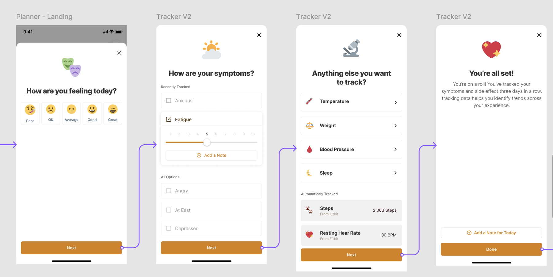
Why emotional state first works: it treats the person, not the symptom, as the subject of the interaction, and it's the reason people kept completing entries when a purely clinical checklist would have seen them disengage.
Why severity-and-context capture works: it gives care teams the nuance to triage properly instead of reacting to a binary symptom-present flag, without asking the patient to write a clinical narrative on their worst days.
The stakes of poor UX are never just usability scores. In healthcare, in finance, in any domain where the system touches people's real lives, design is a form of responsibility. You build it like it matters, because it does.
Reflection
"Clarity is care" isn't a tone-of-voice guideline. Its operational meaning is measurable in reduced cognitive burden, captured in things like completion rates, disengagement patterns, and notification fatigue, not just satisfaction scores.
I'd want more longitudinal outcome data connecting these design changes to patient-reported stress and treatment adherence, beyond the engagement window I had direct visibility into at the time.
This project is the origin of my core AI-era conviction: when systems make decisions that affect real people under stress, transparency and control aren't UX nice-to-haves. They're the product.
How a research prototype with no design involvement became the intelligence layer for an entire enterprise platform.
View case study → Case Study · Capital One Human Judgment in the LoopFraud detection interfaces that kept analysts inside the reasoning chain, explainability work before the field had a name for it.
View case study →