Executive Summary
This is fraud-analyst tooling built on a simple, unfashionable-at-the-time conviction: a model's confidence score is not a product. The reasoning behind it is.
Fraud investigation tooling for analysts working ML-flagged cases across transaction, behavioral, and entity-network signals.
Lead UX/UI Designer, Fraud & Disputes, partnered with a mature, dedicated UX research organization.
Capital One was scaling ML model coverage across fraud ops. Leadership wanted higher case-closure throughput per analyst without adding headcount.
Analysts were handed a single risk score with no way to independently verify, defend, or contest the model's reasoning before acting on it.
Turn "trust the score" into "verify the evidence," building the accountability layer before "explainable AI" was an industry phrase.
Pushed back on an engineering-led "clean single score" direction and designed the reasoning-chain visualization and analyst workflow that replaced it.
Analysts regained real judgment authority instead of rubber-stamping a number. The reasoning-chain pattern became the template reused across the wider fraud and disputes surface, and it's the direct ancestor of the disclosure and audit patterns I still design into AI systems today.
- Risk red reserved for the verdict only, never for the evidence underneath it, so the color itself doesn't pre-judge what the analyst is about to read.
- Entity-graph nodes color-coded by account status, so a fraud ring is visible as a pattern before an analyst reads a single label.
- Light, clinical canvas: a deliberate contrast to the red/amber risk language, so alarm colors stand out instead of competing with a busy interface.
The confidence ring on the case card is the single largest element on the screen, bigger than the account name, bigger than the entity graph beside it. Every node in that graph is drawn at the same size regardless of transaction volume, so an analyst reads the graph's shape (who connects to whom) before any node's size distracts them into reading it as a magnitude chart.
The score sits above the fold, the reasoning chain directly beneath it, and the raw transaction data last, in that order, because that's the order an analyst actually needs to work in: verdict, then justification, then evidence. Nothing about the layout asks them to reverse-engineer the model's logic from the bottom up.
The before/after comparison in Final Experience is built on strict left-right symmetry, same frame, same crop, same scale, with only the interface inside it changed. That rigid symmetry is the point: it isolates the one variable that matters (what the analyst sees) and removes every other visual difference that could confuse the comparison.
The canvas stays clinical and cool, navy chrome, white space, a single info blue, specifically so risk red and entity amber are the only warm colors an analyst ever sees in the tool. When red shows up, it isn't competing against ten other saturated colors for attention. It's the only one there.
The entity graph relies on connectedness and common region: accounts linked by a shared device, address, or transaction path are drawn with visible connecting lines and grouped inside a shared boundary, so a fraud ring reads as one shape instead of a list of individually suspicious accounts an analyst has to mentally connect themselves.
A model's output is not, by itself, a product
The ambiguity here wasn't about the UI. It was about what the model team believed the product actually was.
Fraud detection AI works by aggregating signals (transaction patterns, behavioral anomalies, network connections) into a risk score. The model team's mental model was straightforward: the score is the product, and the interface's job is to be a minimal wrapper around it. Clean number. High confidence. Clear action.
The assumption I had to challenge was that simplification meant removing information. In most software, hiding complexity is the right instinct. In a system where a human is legally and professionally accountable for the outcome, hiding the reasoning doesn't simplify the job. It just moves the complexity into the analyst's head, unaided, with no way to check their own judgment against the model's.
Moving from "the model's API response" to "a usable investigative workspace" meant convincing model and product partners that analyst accountability was a hard product requirement, not a UX nicety layered on top once the "real" work of scoring was done. This was explainability and trust design before the industry had settled on those words for it.
The analyst's path, diagrammed. Four steps, and the reasoning chain is a deliberate detour. Not mandatory, but always one click from the score, so the depth is there the moment an analyst doesn't trust the number on its own.
Key Design Decisions
Three forks in the road, each one a fight against the same default: simplify by hiding, rather than simplify by structuring.
Ship a clean single confidence score, the engineering default, or expose the full chain of contributing signals behind it.
- A single score with a binary approve / deny action.
- A score plus the top three contributing factors, shown as a tooltip.
- A full, traceable reasoning chain: connected incidents, contributing factors, and relative signal weight, explorable on demand.
The score-only option is fast to build and reads as "clean," but it turns analysts into rubber stamps, and when a customer disputes a decline, nobody can reconstruct why it happened. The tooltip option is a half-measure: it still hides most of the reasoning while giving the illusion of transparency. The full chain is the most defensible option, but it risks overwhelming an analyst if it isn't structured carefully.
The full reasoning chain, but progressively disclosed: headline factors visible immediately, with drill-down into the connected-entity graph for anyone who needs to go deeper.
Compliance and legal exposure made this non-negotiable: an undocumented decline decision is a liability, not just a UX gap. Analyst interviews confirmed the human stakes. They needed to defend a decision to a supervisor, or to a customer on the phone, and a bare score gave them nothing to stand on.
Fraud rings surface as linked entities across accounts. Should the tool show one case at a time, the way legacy case-management tools always had, or a connected graph view?
- A flat, familiar case queue: safe, low training cost, matches existing tools.
- A full graph visualization as the primary interface: powerful, but a steep learning curve.
- A hybrid: the case queue stays the default entry point, with the graph as an opt-in drill-down.
Analysts were used to flat queues, and the org needed throughput, not a retraining cycle. But a flat list structurally cannot show cross-account fraud-ring patterns, which was the single highest-value insight the ML models were actually catching. Replacing the queue outright risked adoption friction at exactly the wrong time.
Kept the case queue as the default frame. Any case with linked entities surfaced a connected-entity graph as a drill-in, not a replacement for the familiar view.
I didn't want the highest-value research insight, connected fraud rings, to become invisible just because its natural delivery format scared off adoption. Keeping the familiar frame and adding power underneath it let both things be true.
As model confidence improved, product and engineering proposed auto-closing high-confidence cases without analyst review, to hit a throughput target.
- Auto-close any case above a set confidence threshold.
- Require full analyst sign-off on every closure, regardless of confidence.
- Keep every case in front of a human, but redesign the review experience so high-confidence cases could be reviewed in seconds.
Auto-close hits the efficiency number immediately, but removes an accountable human from a decision that affects a real customer's finances, with no clean way to explain to a regulator, or the customer, why "the system decided." Full manual review at scale doesn't hit the throughput mandate leadership needed at all.
Every case stayed in front of a named human. The redesign pre-surfaced the reasoning chain so high-confidence cases could be reviewed in seconds instead of minutes.
This preserved accountability. A person closes every case, while the redesign still delivered the throughput leadership asked for. The win came from redesigning the review, not from removing the reviewer.
Research & Customer Insights
Capital One's research organization was one of the most mature I've worked inside. That access changed what was possible here.
Signal came from three places: direct research partnership with analysts under real time pressure, escalation patterns from customers disputing declined transactions, and compliance and audit review of what a defensible decision record actually needed to contain.
Shadowing and interviews surfaced a consistent "rubber stamp" behavior pattern: analysts agreeing with scores they hadn't actually evaluated, because the interface gave them nothing else to evaluate.
Became the direct case for Decision 01: replacing the bare score with a structured, explorable reasoning chain.
Support-call escalation data showed agents fielding disputed-decline calls with no way to explain the underlying decision to the customer.
Turned explainability from a UX enhancement into a hard product requirement. The reasoning chain had to be legible enough to explain to someone outside the fraud team entirely.
Product Evolution
From "the score is the product" to "the evidence is the product," in three moves.
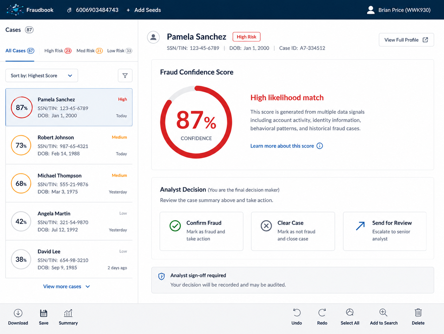
Iteration 1: contributing factors. Added the top signals behind a score as secondary information, a first, incomplete step toward transparency.
Iteration 2: the entity graph. Built the full connected-entity view once research confirmed fraud rings were invisible in a flat list, and made it a drill-down rather than a mandatory new workflow.
Iteration 3: the fast-review pattern. Redesigned the review experience itself so high-confidence cases could be closed in seconds, hitting the throughput goal without removing the analyst from the decision.
"One number. High confidence. Clear action." An interface that asked analysts to agree, not to evaluate.
Explorable evidence, traceable reasoning, a defensible decision an analyst could stand behind under real scrutiny.
Systems Thinking
This project set a pattern I didn't fully recognize as a pattern until I saw myself reapply it years later, on a completely different platform.
"Show Your Work" Interfaces
Designed reasoning-chain visibility as a standing principle before "responsible AI" was a named discipline, not a one-off feature for this team.
A Default, Not an Exception
Reasoning disclosure and audit-trail visibility stopped being a project-specific ask here and became a standing default I bring into every AI system I design since.
Signal-Chain Visibility, Reapplied
The same "make the reasoning inspectable" principle reappears in my SnapLogic governance surfaces: a deliberate, not coincidental, throughline in how I design AI accountability.
Final Experience
What shipped, and why it holds up under the exact kind of scrutiny it was built to survive.
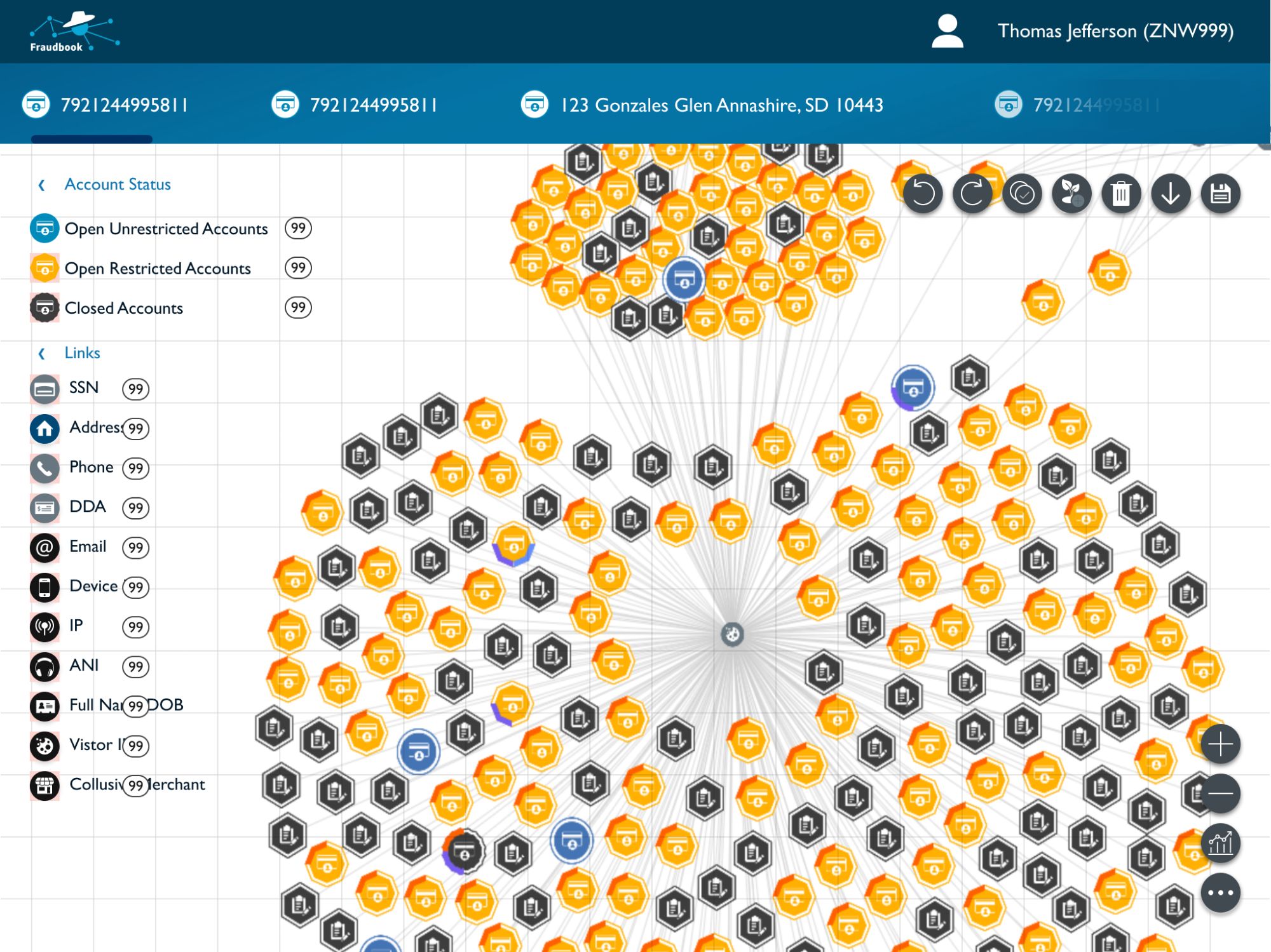
Why named, traceable signals work: a risk factor an analyst can name and inspect is a risk factor they can defend under scrutiny, from a supervisor, a compliance officer, or an angry customer on the phone.
Why the entity graph works: it makes visible the exact pattern, coordinated fraud across account boundaries, that a flat case list is structurally incapable of showing, without forcing every analyst into an unfamiliar workflow to get there.
Show the reasoning, not just the verdict. Design for accountability, not just efficiency. The human in the loop must be capable of real judgment, not just approval.
Reflection
Explainability isn't a UX enhancement. It's a hard product requirement anywhere a human is accountable for an AI-assisted decision. That's not a slogan; it's the line that decided every design tradeoff on this project.
The fast-review time savings were mostly validated qualitatively. I'd push earlier for a rigorous quantitative study to make the case for further investment undeniable to finance and ops leadership.
This project predates "responsible AI" as a named discipline. It planted the throughline (legibility, controllability, accountability) that now defines every AI product decision I make.
How a research prototype with no design involvement became the intelligence layer for an entire enterprise platform.
View case study → Case Study · Memorial Sloan Kettering Dignity as a Design RequirementEnd-to-end care coordination for cancer patients, making "clarity is care" an operating requirement, not a value on a wall.
View case study →